Product Showcase
Built for the way buyers actually search.
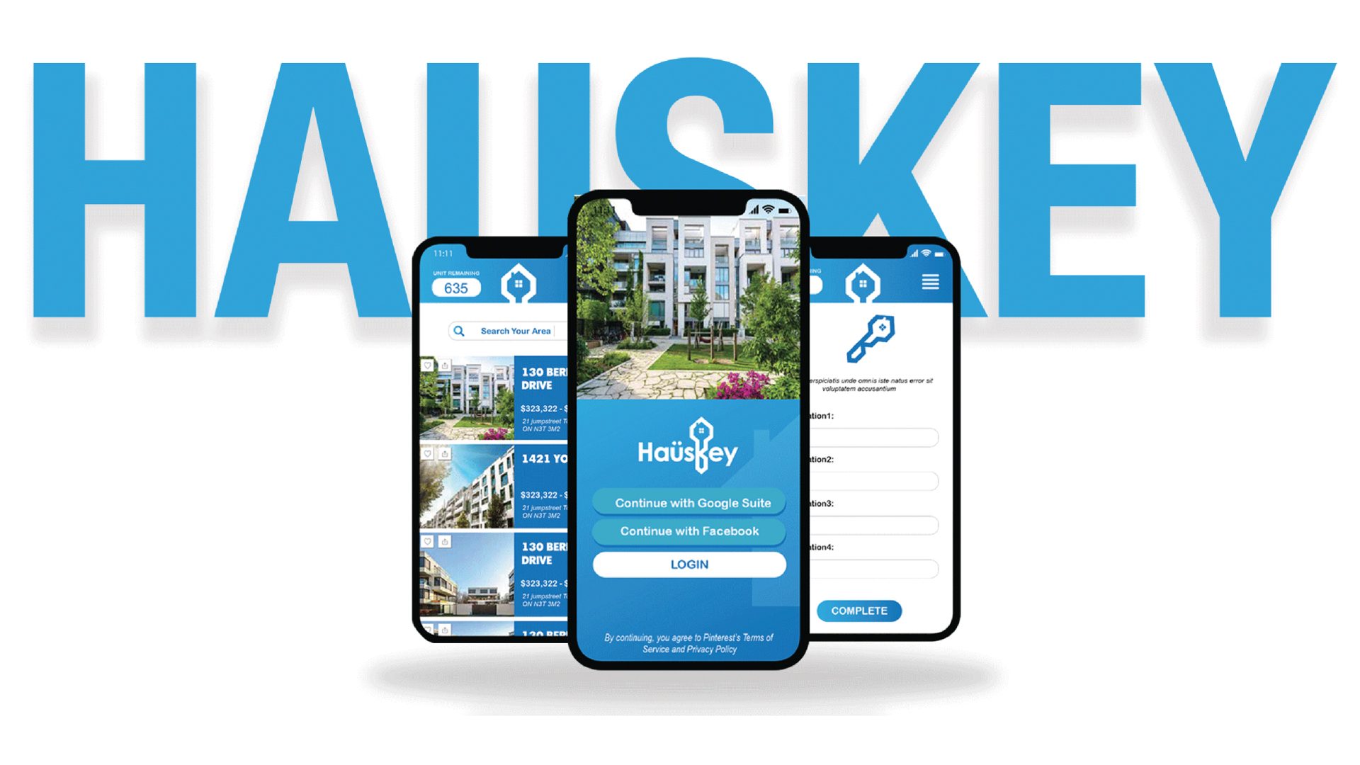
A full product redesign — mobile app, website, and social campaign — for Haüskey, a real estate platform reimagining the Toronto property market.
Haüskey approached me to redesign their mobile app and website — two products at the core of their promise to make Toronto real estate simpler, more transparent, and accessible from your phone.
The existing product lacked hierarchy, made property discovery feel frustrating, and didn't reflect the premium positioning Haüskey wanted in the market. The opportunity was to create something that felt both trustworthy and genuinely delightful to use.
My scope covered the full product experience: user research synthesis, information architecture, high-fidelity UI design for the mobile app, the marketing website redesign, and a social media campaign to launch it all.
The Toronto housing market moves fast and carries enormous emotional weight. The existing Haüskey product wasn't keeping pace — users were dropping off before ever discovering a property that suited them.
Users couldn't quickly narrow down relevant properties. The search and filter experience was buried, inconsistent, and lacked spatial context — a critical gap for a geo-driven product.
The mobile experience communicated data, not lifestyle. Buying a home is one of the most emotional decisions in a person's life — the product needed to reflect that weight and aspiration.
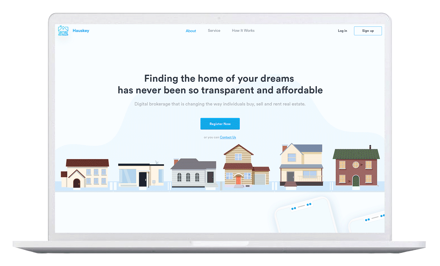
The marketing site was unclear about Haüskey's value proposition. Visitors left without understanding what the product did or why it was different from traditional real estate tools.
There was no cohesive social media identity. Creative assets were inconsistent and didn't communicate the "forever home" narrative Haüskey needed to connect emotionally with buyers.
Pages and flows were organized around internal logic, not user intent. New users couldn't orient themselves — they didn't know where to start or what step came next.
Toronto real estate tech was commoditized and visually dated. A premium, well-considered experience could establish Haüskey as the most trusted name in the space.
Every design decision was grounded in research and tested against real user behavior. No assumptions, no decoration for its own sake.
I began by mapping the competitive landscape across Toronto real estate platforms, conducting a heuristic audit of the existing app, and synthesizing user pain points from available feedback. This gave me a clear picture of the jobs-to-be-done and the emotional moments that mattered most.
Working closely with the Haüskey team, I created a full sitemap as the structural foundation. I proposed and designed a filtering architecture that simplified property discovery — organizing browsing by price range, neighborhood, and property type in a way that matched how real buyers think.
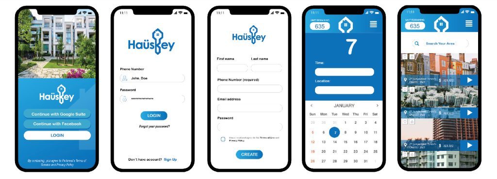
Low-fidelity wireframes across all key flows allowed rapid iteration without the weight of visual decisions. I tested multiple layouts for the property listing card, map view, and onboarding flow before committing to the final direction.
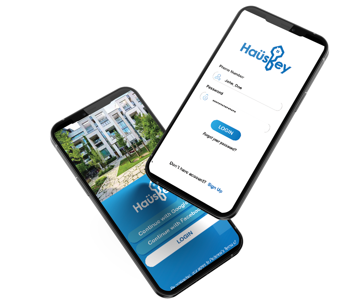
I built the Haüskey design system from the ground up — establishing type scale, color tokens, spacing rhythm, and a component library that would scale across app, web, and social. Every component was designed with both precision and warmth.
With the design system locked in, I produced pixel-perfect high-fidelity screens for the app, website, and social creative suite. Assets were organized and documented for seamless developer handoff.
Every token, component, and pattern defined to create a consistent, scalable product that communicates trust and quality at every touchpoint.
Features aren't just functional — they communicate the product's personality and build confidence in the buyer's journey.
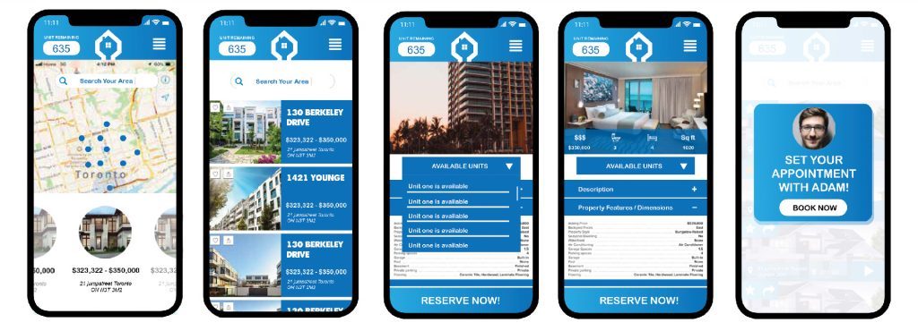
I designed a map-centric browsing experience so buyers can understand neighbourhood context before committing to a listing. Properties appear as interactive pins with live pricing — no tab-switching required.
Price, bedrooms, neighbourhood, and property type — in a single unified panel that doesn't interrupt the browsing flow.
Property cards show the full picture — hero image, price, key stats, and a saved-state toggle — all at a glance without opening the detail page.
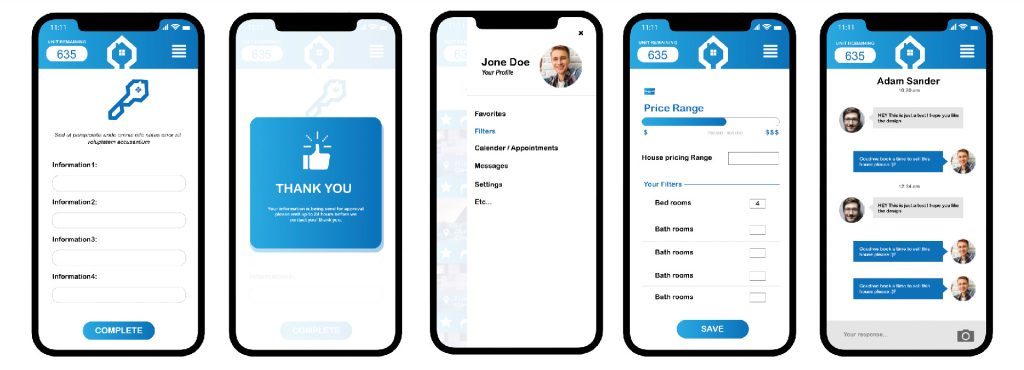
A guided setup flow helps buyers define what home means to them: budget, lifestyle, and timeline — transforming cold leads into qualified, engaged users.
The marketing site was rebuilt to clearly communicate Haüskey's value proposition in the first scroll. New sitemap, clearer calls to action, and an educational flow that guides visitors toward app download.
The redesign delivered measurable improvements across engagement, retention, and brand perception — establishing Haüskey as a premium product in the Toronto market.
This project sharpened my ability to design for high-stakes decisions. Real estate purchases carry enormous emotional weight — the product needed to feel trustworthy above all else, and every design choice was filtered through that lens.
Working across three surfaces simultaneously (app, website, social) forced clarity. Decisions made in the design system had to hold up whether rendered on a 6-inch phone or a 1440p desktop — a discipline that made each deliverable stronger.
The biggest win was the filter architecture. A small structural decision — proposing a unified filter panel rather than scattered controls — ended up being the most impactful thing I contributed to the product experience.
In real estate, doubt is the enemy of conversion. Every color choice, typographic decision, and micro-copy moment contributes to — or erodes — the feeling of safety and reliability.
Designing a component in isolation without the design system leads to rework. Starting with tokens and type scale, even loosely, made every subsequent screen faster and more consistent.
Users need to understand where a property sits before they care about the listing. The map-first view wasn't just a feature — it was the organizing principle the entire app structure should flow from.
The social ads and the in-app experience needed to feel like the same brand. Designing them together, with a shared visual system, meant users who arrived from an ad already felt at home in the product.