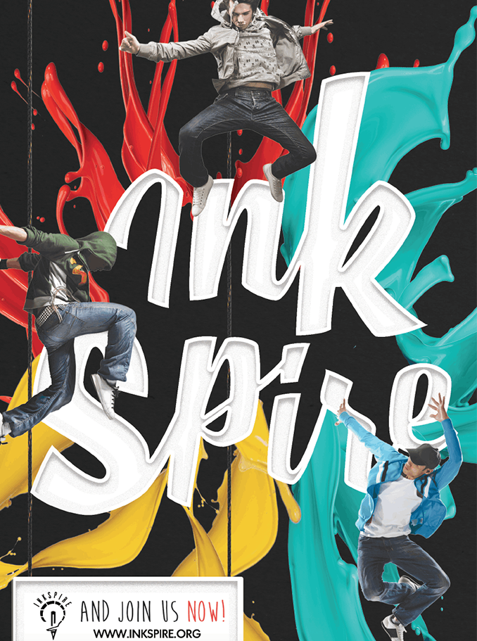
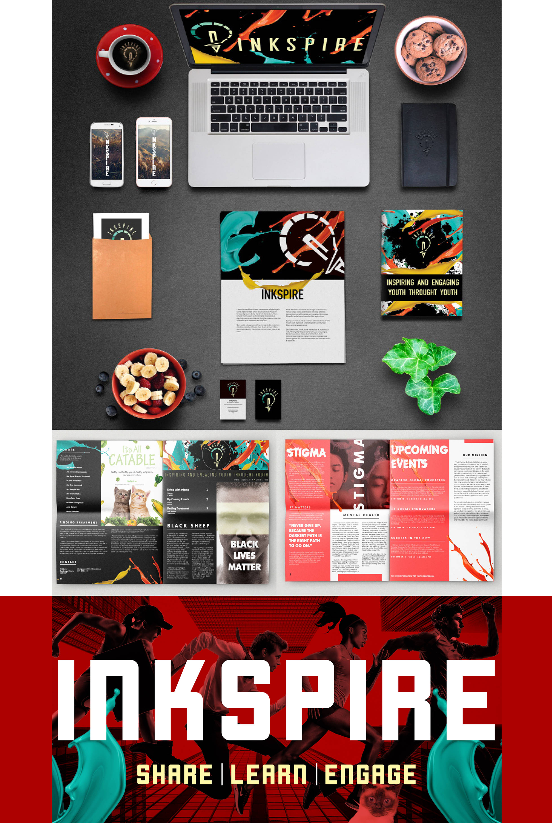
Brand Identity Case Study

Giving Youth
a Voice.

A complete rebrand for Inkspire — a youth-led nonprofit amplifying young writers through emotion-driven design and vibrant character storytelling.

Explore the Project
Inkspire Ad 1 Inkspire Ad 2 Inkspire Ad 3 Inkspire Body Inkspire Mascot Inkspire Ad 1 Inkspire Ad 2 Inkspire Ad 3 Inkspire Body Inkspire Mascot
Scroll
Brand Identity
Social Media
Creative Direction
Character Creation
Print Media
Color Systems
Mascot Design
Youth Advocacy
Brand Identity
Social Media
Creative Direction
Character Creation
Print Media
Color Systems
Mascot Design
Youth Advocacy
0+
Brand Deliverables
0%
Emotion-Driven Design
0
Original Mascot Characters
0°
Brand System Coverage

Under-represented
young voices.

Inkspire is a youth-led nonprofit on a mission to empower young writers and amplify their voices through online publication. The challenge was clear: mainstream media consistently under-represents young voices, and Inkspire needed a brand identity bold enough to change that narrative.

The rebrand needed to feel approachable for youth audiences while remaining credible enough to engage partners and sponsors — a balancing act that demanded a fresh, emotionally resonant design language.

01

No Emotional Identity

The existing brand lacked a cohesive emotional language. Young readers couldn't connect with the visual presentation, leading to low engagement.

02

Audience Disconnect

Content tackling difficult themes — mental health, identity, social justice — felt cold and inaccessible. Design needed to make hard topics feel approachable.

03

Inconsistent Brand Voice

Without a unified visual system, every publication looked different. There was no mascot, no palette logic, and no cohesion across print and digital channels.

Deliverable 01

Style With
Colours.

We developed a bespoke emotion-based color system to connect authentically with Inkspire's audience. Each hue was chosen to represent a distinct emotional state — making difficult content feel more approachable without diluting its importance.

The palette works across digital and print, ensuring emotional consistency wherever the brand appears.

Deliverable 02

The Cool
Cats.

We created a family of mascot characters — each one anchored to a thematic color from the emotion palette. These "Cool Cats" personify the brand's visual language, making abstract emotions tangible and building a deeper connection with young audiences.

Character design was optimized for web-first distribution — crisp on screen, flexible for social, and endlessly remixable.

Deliverable 03

Social &
Print Media.

From Instagram templates to printed editorial spreads, every touchpoint was rebuilt under the new system. Ads, social posts, and publication covers all speak the same emotional language — cohesive, bold, and unmistakably Inkspire.

The Full
Picture.

Brand Overview
Core Identity Brand System
Campaign 1
Social Campaign Assets
Mascot
Characters Mascot Design
5+

Deliverables across print, digital, and character design

Approach
Emotion-driven
color systems
Campaign 2
Print Editorial Ads
Animated Brand
Motion Animated Brand Identity

Results That
Matter.

0°
Full Brand Coverage

A unified system spanning social media, print, digital publishing, and motion — every channel speaks the same language.

0
Original Mascot Characters

The Cool Cats gave Inkspire a living, breathing cast of characters — instantly recognizable and endlessly extendable.

0%
Emotion-Led Color System

Every hue in the palette ties back to a real human emotion — giving designers and editors a language to work with, not just a swatch book.

0+
Brand Deliverables Shipped

From logo system to mascots, from campaign ads to motion assets — a complete brand toolkit delivered and ready to deploy.

"Design that makes young voices feel heard — not just seen. That's the standard we built Inkspire's brand around."
— Fonnt Solutions · Creative Director